sisalcarpet.com now redirects to curranfloor.com. Same products and company, one destination for all Curran flooring.

The Sisal Mirage: How Two Designers Recreated the Look of Sisal
The Opportunity
For years, Curran explored ways to bring the look of woven sisal into a modular carpet tile. The idea grew out of years of helping designers specify natural sisal for commercial projects. Time and again, the team saw the same challenge: designers wanted the warmth and authenticity of natural fiber flooring but needed the durability, performance, and ease of maintenance required in commercial interiors. Curran set out to deliver both.
It sounded straightforward. It wasn't.
Stephanie Piché, Head of Product Development, and Founder Jeff Curran explored woven constructions, tested materials, and worked with manufacturers around the world. While several woven prototypes captured aspects of the sisal aesthetic, none delivered the stability and performance required for a commercial carpet tile.
They realized that forcing a woven construction was not the answer.
Instead, they looked to a proven commercial construction: tufted. “There’s a reason all commercial-grade tiles are tufted. They have high endurance, a flat profile, and exceptional stability," Stephanie explained. With the construction decision made, the challenge became recreating the visual character of woven sisal.
Seeing Sisal
The project took a new direction when Jeff met award-winning, Mexico City-based textile and surface designer Cristina Orozco Cuevas at Heimtextil in Frankfurt. Jeff shared an early sisal-look concept and explained the problem: the results looked too digital and artificial. He wanted something that looked more natural. Cristina showed him examples of her surface designs that evoke woven texture, and proposed, “Let’s create some tests that simulate a real woven fabric, something that doesn’t even exist in reality.”
That exchange changed the approach.
After returning from Heimtextil, Jeff connected Cristina with Stephanie. Their roles were complementary: Stephanie brought the product vision and technical development, while Cristina translated that vision into a surface that could convincingly evoke natural sisal.
Cristina began by studying the material itself.
Derived from the Agave sisalana plant, sisal has a distinctive luster, subtle color variation, and natural irregularities that give it its unmistakable character.
To capture those qualities, Cristina examined how the fibers reflected light, how their color shifted throughout the day, and how subtle irregularities created movement across the surface. She scanned yarns, analyzed woven structures, and experimented with multiple digital techniques, refining roughly a dozen design variations before the final optic emerged.
Throughout the process, Stephanie remained convinced they would find the answer. Cristina recalled doubting whether the project was possible: "I really thought, ‘I don't think I'm going to be able to pull this off’." Stephanie’s response never changed: “No, I think we’re going to get this.”

%2Ff_auto%2Fq_auto%2Fw_1280%2Fv1782755636%2FFlooring%2FVendors%2FSynSisal%20Tile%2FBeauty_Images%2Fridge_honeycomb_SS_tile_theshire_CG_7_hb12ds.webp&w=2560&q=65)
%2Ff_auto%2Fq_auto%2Fw_1280%2Fv1782755613%2FFlooring%2FVendors%2FSynSisal%20Tile%2FBeauty_Images%2Fridge_honeycomb_SS_tile_theshire_CG_1_k77kuq.webp&w=2560&q=65)
The Tipping Point
One of the biggest breakthroughs came when the duo stopped trying to solve pattern and color at the same time. Cristina suggested, "Let's forget about the color and resolve first how the pattern is going to flow."
"Let's get this depth. Let's get the highlights, the lowlights. Let's get the dimension in. Then we can come back to the color." - Stephanie
Once the depth, highlights, lowlights, and movement felt authentic, the color palette came together much more naturally. Stephanie later described that decision as the project's "tipping point."

From Pattern to Palette
Once the visual pattern was set, the final color development went relatively smoothly. “Color can be very difficult to manage,” according to Cristina, because the base material could shift the result significantly; even subtle differences among warm, cool, blue, yellow, or greyish whites change the overall effect.
Rather than relying on a single color, each design was built from multiple layered tones to recreate the variation found in natural sisal. Digital printing wasn't simply a matter of selecting Pantone colors. The printed colors interacted with the texture of the loop-pile surface and mixed optically, making close coordination with the factory especially important.
As Cristina explored the possibilities, she developed dozens of color studies, many she never even shared. The plan called for three colorways, but one unexpected color proved too strong to leave behind, and the debut palette became four: Honeycomb, Pebble, Shale, and Walnut.
Building the Illusion
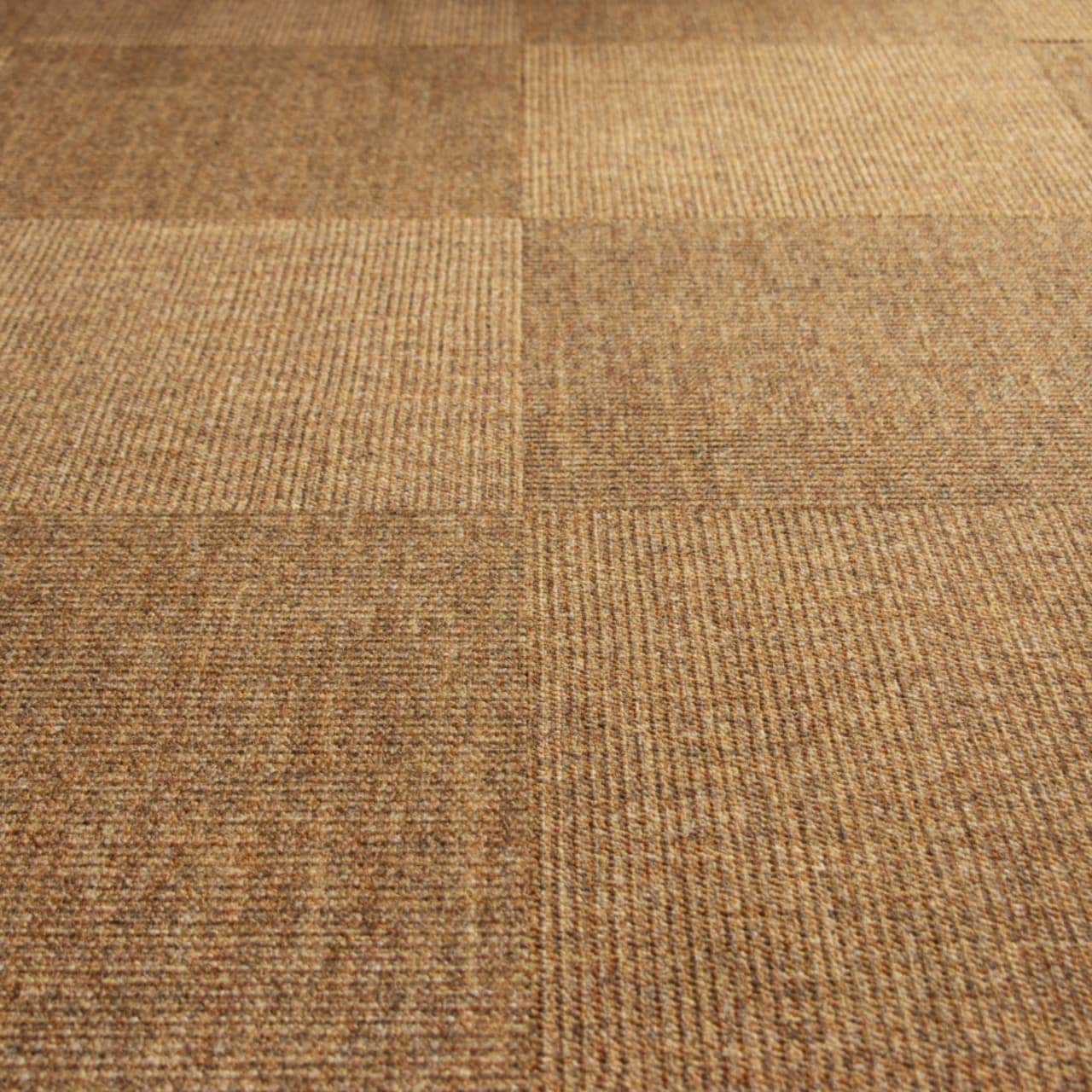
Every element had to work together. From the tufted loop construction and the layered colors to the digitally printed textile surface, "Every color, flaw, detail, modification mattered," according to Cristina. Together, Stephanie and Cristina built the dimension needed to convince the eye it was looking at woven sisal rather than a printed carpet tile.
It was the yarn treatment, the tufted texture of the pile, the way Cristina's design worked on top of that texture... It's like layers of thought and choices that get you where you want to go. - Stephanie Piché
The team also designed beyond a single tile. The debut Ridge Tile was developed to read as a continuous surface across an installation, whether installed monolithically or quarter turned. From a distance, the individual tiles visually recede, allowing the flooring to read more like broadloom natural sisal than a modular product.
For Stephanie, the defining moment came when they viewed larger production samples instead of small strike-offs. "Seeing the larger format was everything...the design really comes to life when you're looking at it in a larger scale." They had achieved what they had been pursuing all along: not a copy of woven sisal, but the experience of seeing it.
Inspired by Place
Ridge, the inaugural style in the SynSisal® Tile collection, takes its name from the mountain ridges and natural landscapes that have long influenced Curran's design perspective.
The name emerged late in the development process, after the design itself was complete. As the team reflected on the story behind the collection, they kept returning to the landscapes that inspire Curran. As Stephanie explained, "The grandeur of nature and natural textures inspires us as a company. Barbara being from Switzerland and us being here in the Pacific Northwest—the mountains, the rivers, the desert—all of these beautiful places came through in the color development and ultimately led to the naming convention. I love where we landed with it."

Natural Design with a Performance Edge
Every design decision behind SynSisal Tile considered the realities of commercial interiors. Inspired by the visual language of sisal, SynSisal Tile captures that same quiet character through woven-inspired texture, layered color, and organic movement. The modular format offers flexibility for installation and maintenance, while the dimensional sisal-inspired optic creates a quiet, natural foundation that works across a wide range of spaces. As hospitality, workplace, and wellness environments continue to embrace biophilic design, materials that reference the natural world have become increasingly important.
Meet the Designers

Stephanie Piché leads product development at Curran, where she combines creative vision with technical expertise to bring new flooring concepts to market. With a background spanning home textiles, product design, and commercial flooring, she has spent more than a decade developing products that balance aesthetics, manufacturing, and performance. She led the vision for SynSisal Tile, guiding its development from concept through material selection, supplier collaboration, and final production.

Cristina Orozco Cuevas is an award-winning textile and surface designer with nearly 20 years of experience creating textiles for hospitality, furniture, wallcoverings, and interior applications. Known for her ability to bring movement, depth, and natural character to surfaces, she specializes in translating complex material qualities into refined textile designs. Her expertise spans the development process from concept to collection, combining surface design with a technical understanding of color, yarn, construction, and weaving. For SynSisal Tile, that background informed how she used digital print to create movement, depth, and a textile surface with the appearance of a woven surface.